
The Power of Color in Filmmaking: A Behind-the-Scenes Look at My Work


Hey, people that I respect, you guys! Today, I want to chat about something that might seem like a small detail but is actually a massive part of filmmaking—
COLOR.
Yep, those hues you see on screen can make you feel all sorts of ways, often without you even realizing it. So, let’s dive into how I use color in my films and series, specifically in some key scenes from my work.

Why Color Matters More Than You Think?
Before we jump into the nitty-gritty, let me tell you why I’m so obsessed with color.
When I was a kid, I read that colors affect people’s emotions more than 80% of the time. That statistic blew my mind! Ever since I’ve been fascinated by how something as simple as a color can evoke such strong feelings. In filmmaking, color isn’t just an afterthought; it’s a powerful tool for storytelling.
Every color has its own vibe. Think about it—red can make you feel excited or even anxious, while blue might make you feel calm or sad. I’m not just picking costumes randomly or throwing some colors into the background because they look pretty. Oh no, I’m super picky about this stuff. My lighting technician and costume department often joke about how I drive them crazy with my specific color requests. But there’s a reason behind every choice, trust me.

Scene Breakdown: Hope, Heat, Sadness, and Thriller
Now, let’s get into the fun part—breaking down four scenes where color played a starring role.
1. Hope in ‘Call It What You Want’

CLICK TO WATCH
In this scene from Call It What You Want, I chose brown and green for Marco’s costume. Brown is such a grounding color, don’t you think? It represents trust, like the sturdy trunk of a tree 🌲. Marco is the anchor in this scene, the one you can rely on. Bas, on the other hand, is wearing a costume with cage-like patterns, symbolizing how trapped he feels emotionally. The greyish atmosphere around them adds a layer of melancholy, making you feel the weight of the situation.
But here’s the twist—the green around Marco represents home. It’s like a tiny glimmer of hope in the midst of all this gloom. Ever feel like you’re lost in a jungle, but somehow, it feels like home? That’s what I wanted to capture here. The orange hues from the setting sun also sneak in a bit of warmth, reminding you that not all is lost.
2. The Heat of the Moment in ‘Till The World Ends’

CLICK TO WATCH
Okay, let’s talk about that hot scene from Till The World Ends. You know the one. Art’s feelings are front and center here, and I wanted the colors to reflect that intense first-time experience. His skin tone, soft and a bit glistening, is paired with a backdrop of white, pink, and a hint of red. The white and pink give off a vibe of innocence, like a virgin (TOUCH FOR THE VERY FIRST TIME), but the red adds a layer of raw passion.
And let’s not forget Golf’s skin, which is sprayed with a bit of red and grey. It’s almost like the audience is being drawn into the scene, feeling the heat themselves (yeah, I’m a bit dirty-minded, I admit). The grey and blue tones also add an element of mistrust, keeping you on edge. In Asian cultures, green and blue can be pretty scary—think of how these colors are often used in Japanese and Korean horror films. They represent the unknown, the mysterious forces of nature we can’t quite trust.
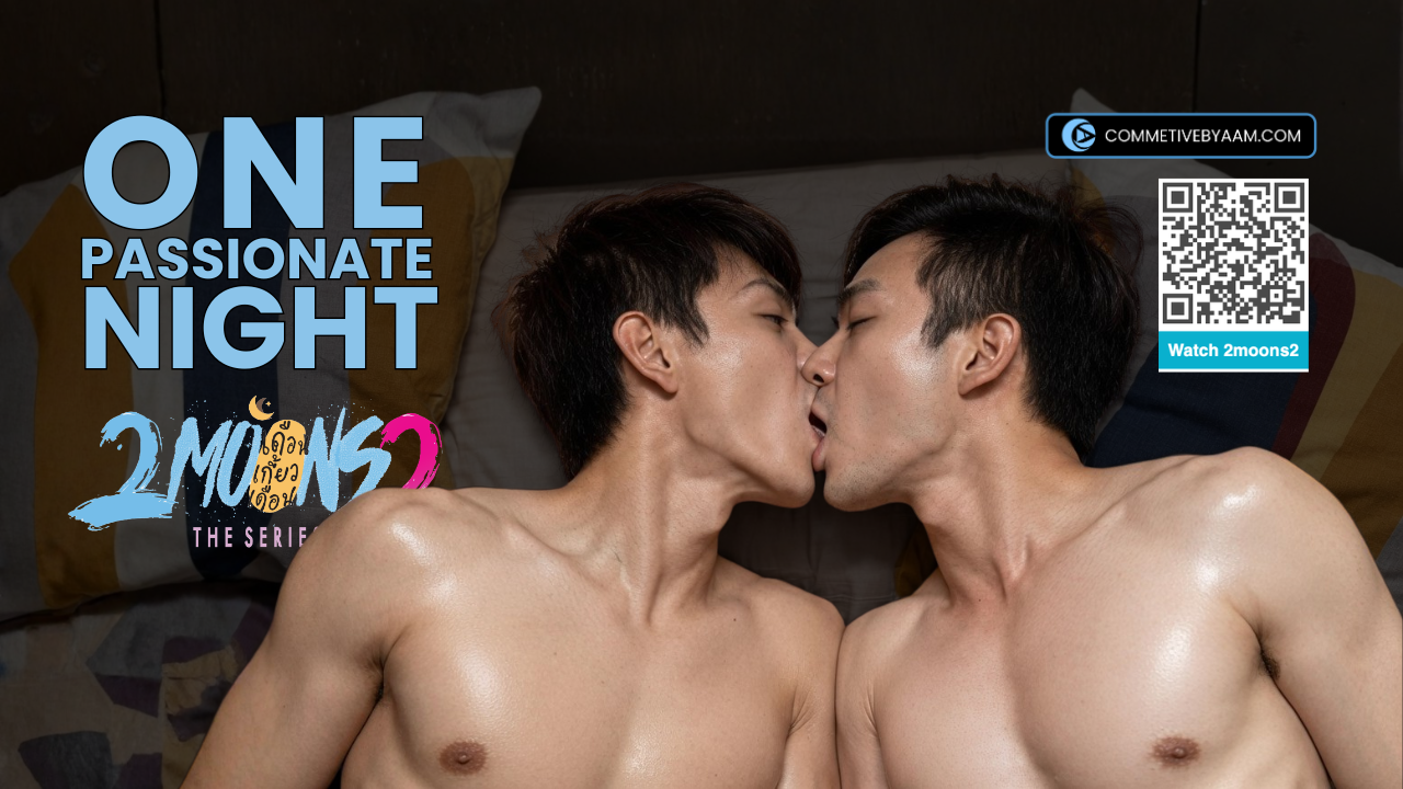
3. Drowning in Sadness

CLICK TO WATCH
This next scene is all about the blues—literally and figuratively. The color blue dominates this moment, representing sadness and deep emotion. Ever heard the phrase “feeling blue”? That’s exactly what I was going for. Blue is such a multifaceted color. On one hand, it’s the color of sadness, but it also commands respect, like the vast, untouchable ocean.
Golf’s costume is heavy on the blue, not because he’s just sad, but because he’s about to reveal some hard truths. He wants Art to believe him, but at the same time, he’s battling his own demons. Art, on the other hand, is dressed in softer shades, his sadness almost overpowering Golf’s character. The grey tones add an element of ambiguity—there are unresolved issues hanging in the air, and you can feel it.
4. The Thriller Element

Last but not least, let’s talk about the thriller scene. Both characters are dressed in white T-shirts, a deliberate choice to highlight their innocence. These two are just trying to survive in a world that’s anything but kind. I chose old green and brown tones for the background to create a sense of safety, like everything’s going to be okay—even if it’s not.
The cream colors add a touch of softness, while the orange light subtly hints at hope. But don’t get too comfortable—the green tones also carry a hint of danger. In a way, this scene plays with your emotions, making you feel safe while keeping you on edge.
Wrapping It Up
So, there you have it—color isn’t just a visual element in my films; it’s an emotional trigger. Almost 90% of what you feel while watching a scene is influenced by color, whether you realize it or not.
If you’ve seen these scenes, I’d love to hear what you think. Did the colors make you feel a certain way? Did you catch the subtle hints of hope, passion, sadness, or tension? And if you haven’t seen them yet, what are you waiting for? You can find them on Amazon Prime, Vimeo, or even YouTube (though I highly recommend the full versions).

Colors are more than just a pretty backdrop—they’re a vital part of storytelling. Next time you watch a movie, pay attention to the colors. You might be surprised by how much they’re influencing your emotions.


#Filmmaking, #ColorTheory, #FilmProduction, #VisualStorytelling, #Cinematography, #MovieColors, #FilmAesthetics, #BehindTheScenes, #FilmMakingProcess, #EmotionalImpact, #CreativeDirection, #FilmDirector, #ArtInFilm, #Storytelling, #CinemaArt, #FilmInspiration, #DirectorTalk, #ColorPsychology, #FilmDesign, #MovieMagic