Because of Color, That’s Why This Commercial is Controversial (in Thailand)
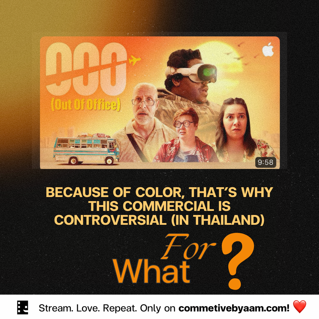
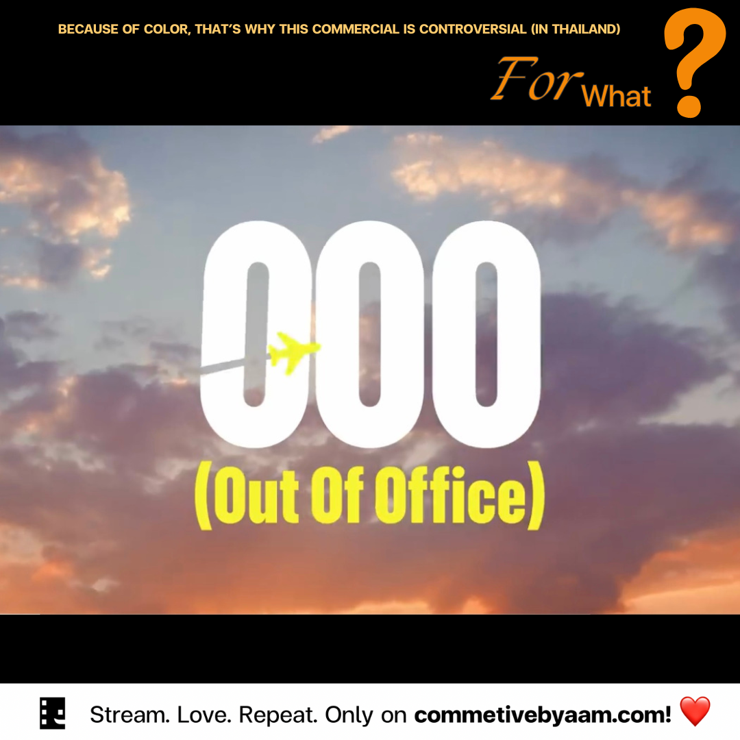
Listen, there is drama in Thailand right now about the new Apple short film, a commercial that was just released. People claim that somehow Apple is discriminating against or looking down on Thai people or the whole country. I recently watched it and have some thoughts on it.
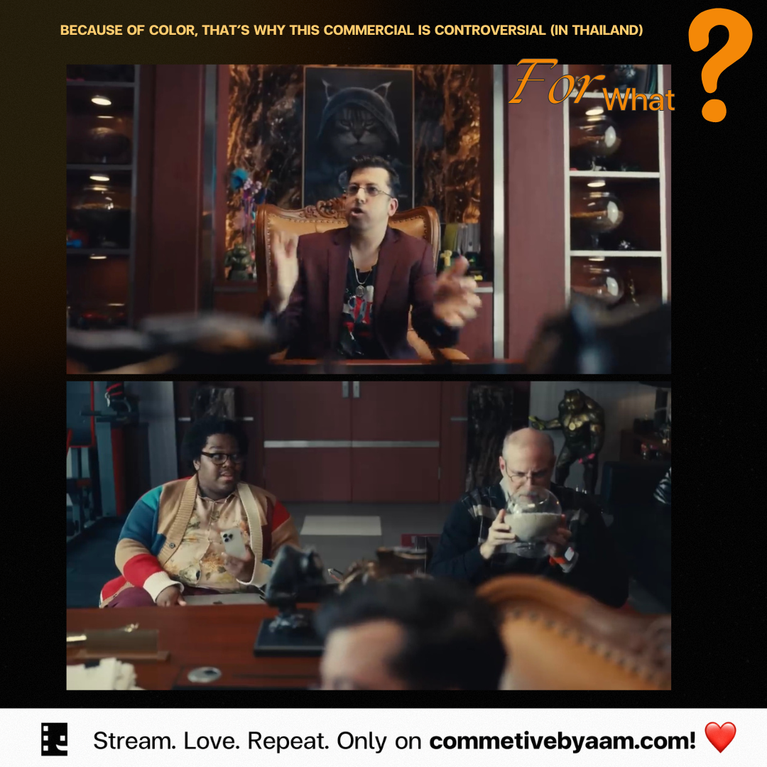
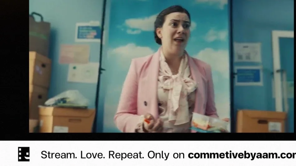
The story revolves around three people visiting Thailand to find a factory for their product. First and foremost, I admire the way they used color throughout the film. Did you notice the contrast between the boss, highlighted with a yellow background symbolizing hope and power, and the team, depicted in gray, which felt hopeless? Yellow and orange often represent future potential, like the morning sunshine, and this contrast was effectively used to show moments of inspiration.
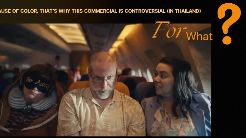
The airplane scenes were filled with orange and yellow hues, contrasting sharply with the characters’ costumes: teenagers, travelers, and business attire.
This visual contrast was striking. The sky during the “magic hour,” just before sunset, was beautifully captured. It’s challenging to film in this light, and if they did it for real, it’s impressive.
However, there were some inconsistencies, like the scene at Don Mueang Airport, which doesn’t handle long-haul international flights. The use of blue was notable, representing both sadness and respect. Blue’s dual nature, often associated with feeling down (“feeling blue”) and the vast, respected ocean, was well-used to convey a sense of inevitability.
The vibrant orange and yellow scene when the characters return to Thailand, particularly the immigration officer, was striking. The hotel’s name, “Sunrise Paradise,” played on Western perceptions of Thailand as a land of sunshine, which made sense. The gray tones used while waiting for a bath at the airport conveyed an old-fashioned feel, which was an interesting choice.
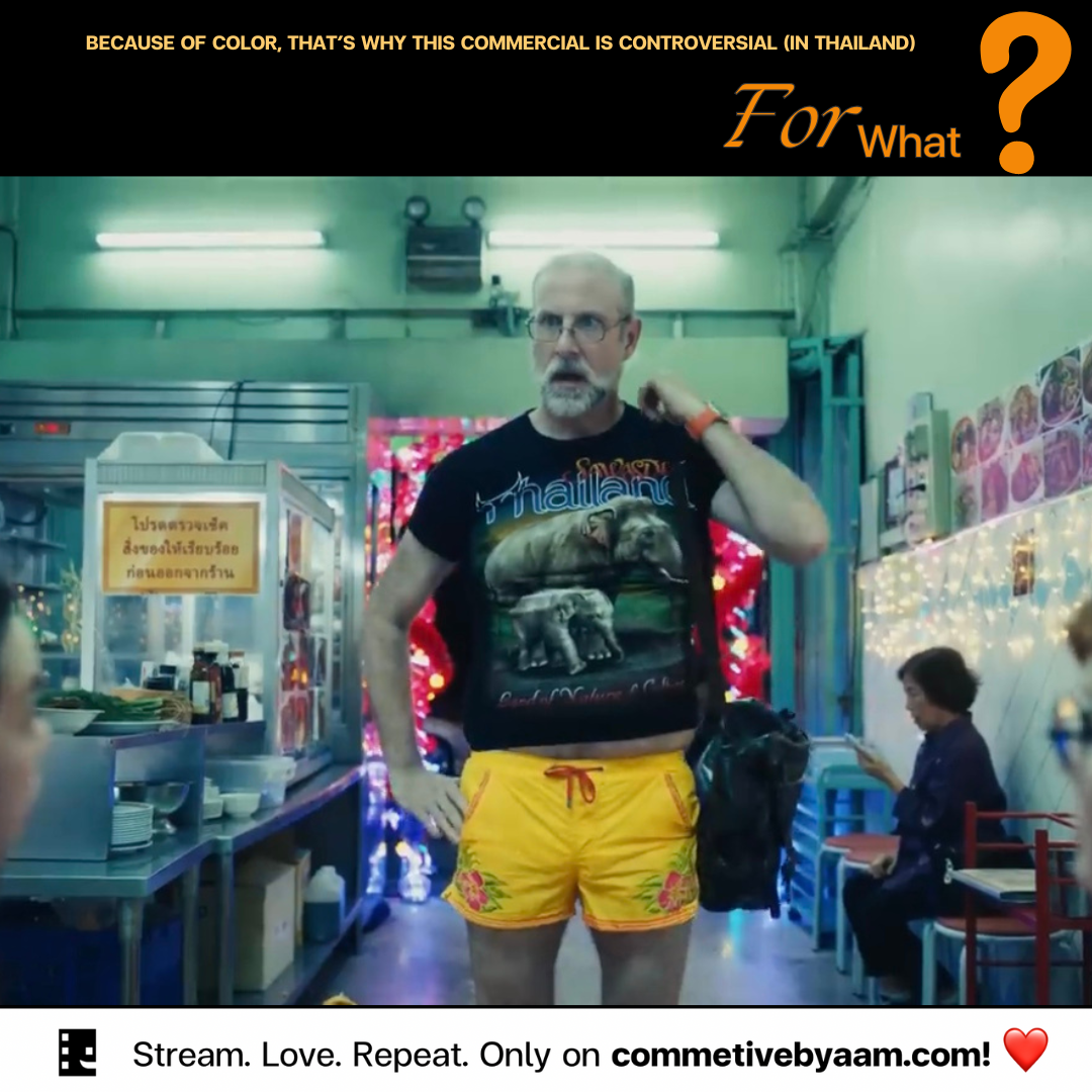
The quick production of this film was evident. The color use between the USA and Thailand was so similar that it felt like the USA scenes were shot in Thailand. There was no clear explanation for the character’s leg injury. The restaurant costumes were stereotypically foreign, and the food choices, like french fries, bagels, and pad Thai, didn’t seem well-researched. It felt more like a foreigner’s view of Thailand rather than an authentic representation.
The bento-style meal presentation was enjoyable, suggesting a straightforward comparison of elements. The characters’ jet lag, rather than the hotel’s cleanliness, seemed to be the reason for their sleeplessness, but the message was unclear. I was surprised by the old-fashioned color tones used during their enjoyable times in Thailand, reminiscent of shooting on film rather than digital, even though it was likely all digital.
Overall, the commercial felt cliché, reflecting typical foreign perceptions of Thailand. The color use, while typical of film school techniques, was well-executed. The storyline wasn’t particularly impressive and seemed under-researched. I didn’t find it discriminatory. On the contrary, it felt like an admiration of Thailand. I don’t understand the sensitivity around this commercial – we should be proud. It may not leave a lasting impact, but it’s a decent representation.
I want to tell my fellow Thai people not to be too sensitive about this commercial. We are better than this. The whole world knows what’s going on in Thailand; people are smart enough to distinguish between what is right and what is wrong, what is real and what is fake. This commercial or short film can’t impact the world significantly. The world is tough – sometimes, you need to wear a helmet. Let’s not overreact and instead focus on the positives.
These are just my suggestions. We have the right to hate this, criticize whatever we want, but Apple has the right not to care or release an apology statement. Again, don’t be sensitive.
